Flora's Door

Whats On The Menu?
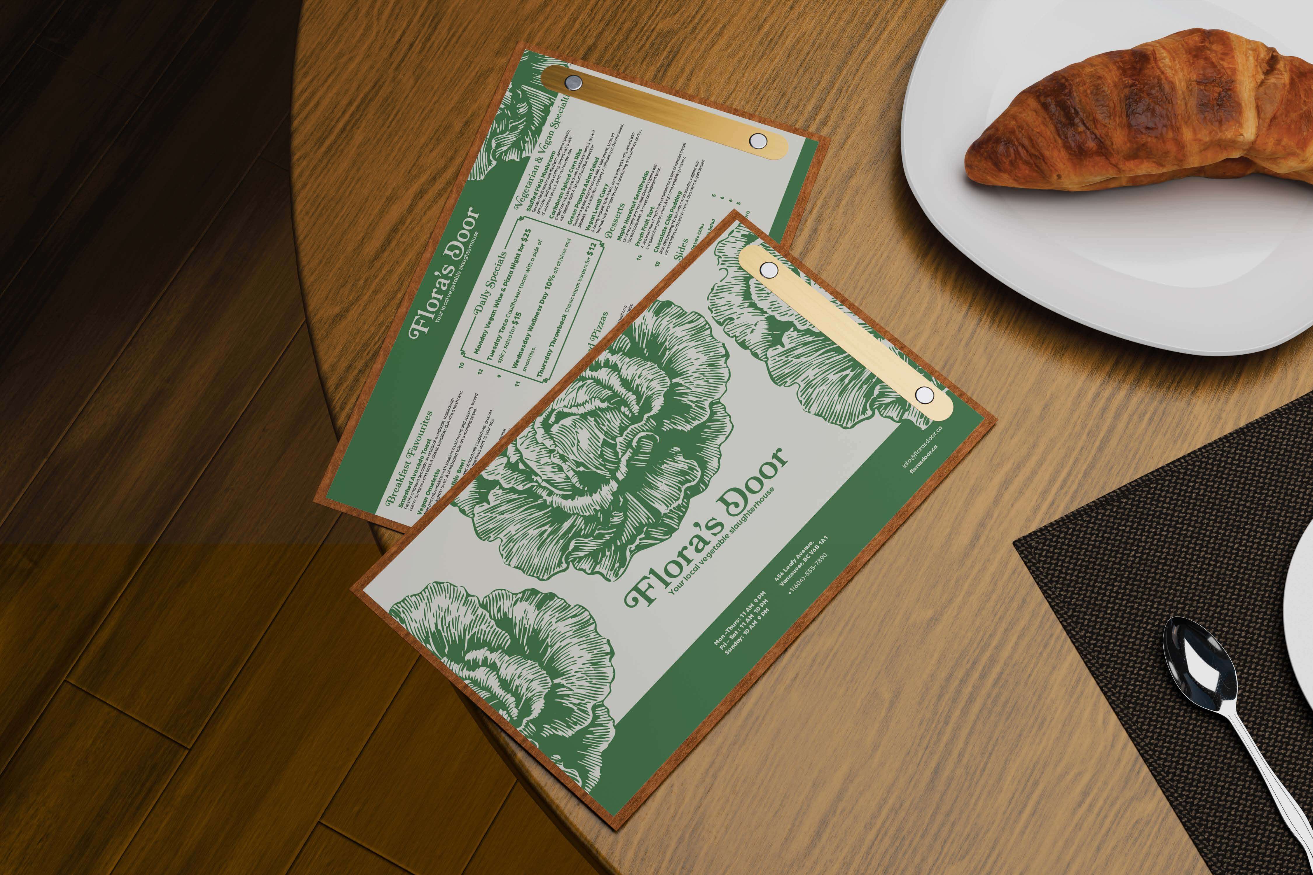
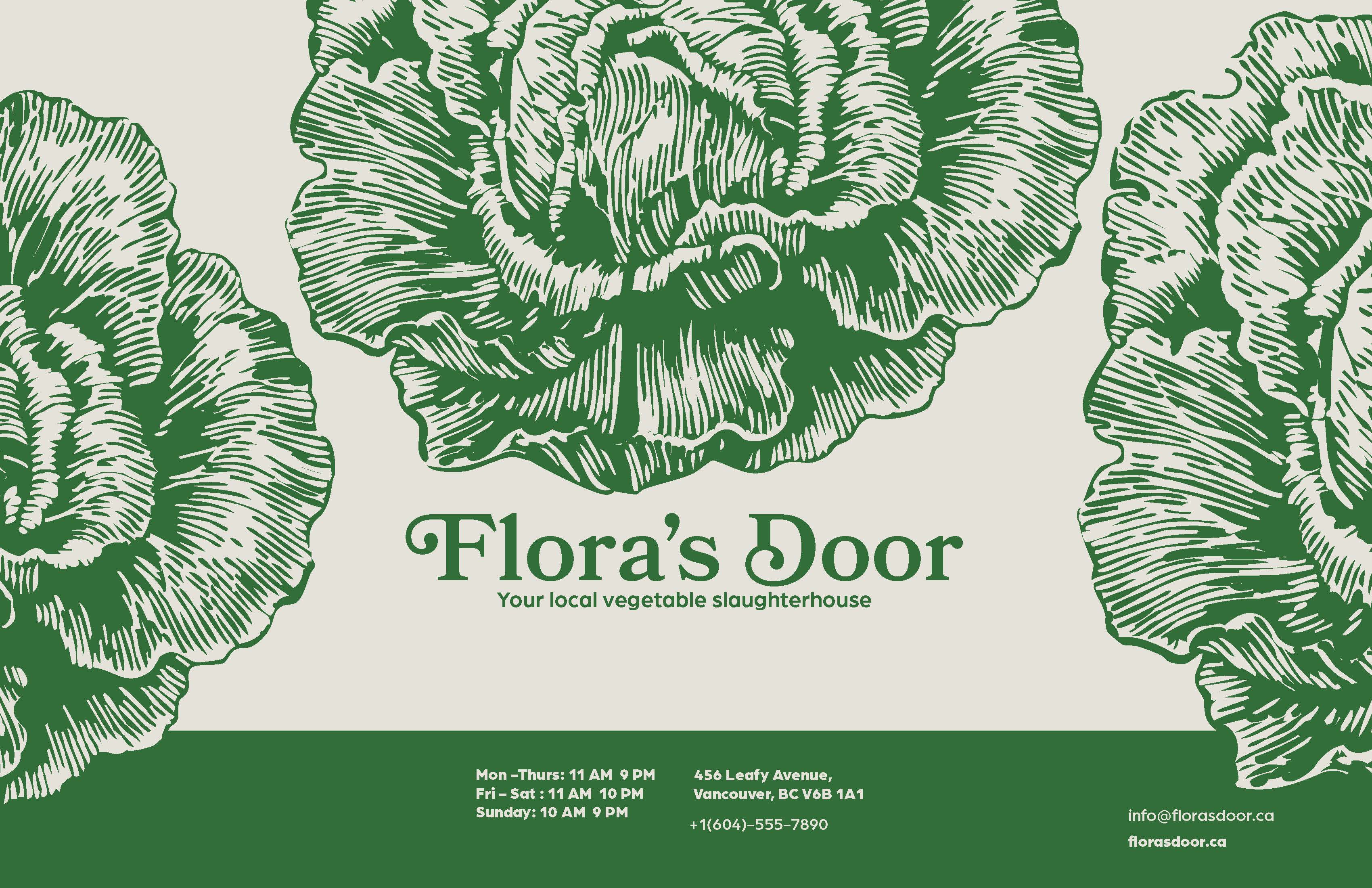
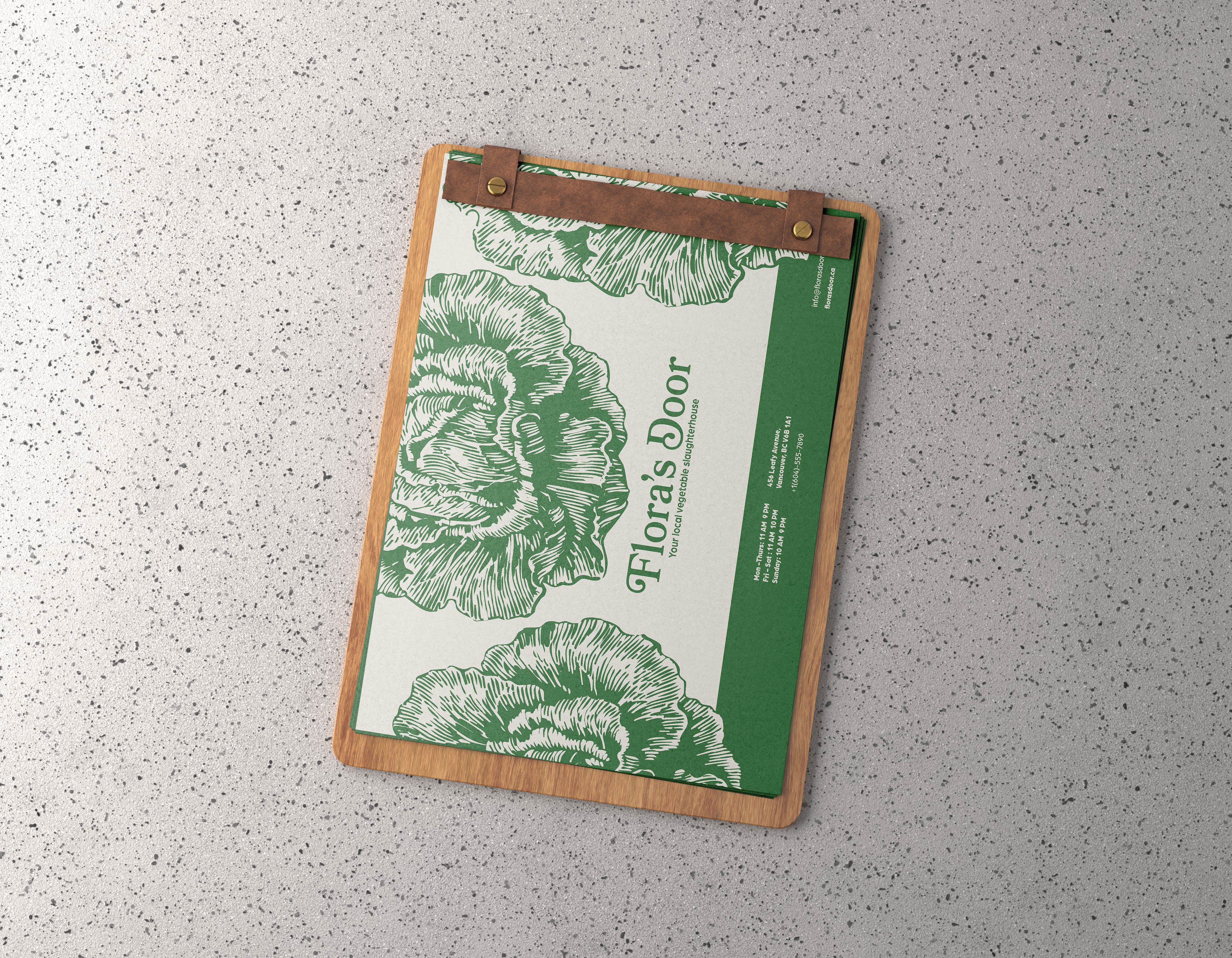
Flora Door was a three-week typography project centred on building a cohesive imaginary brand for a vegan restaurant. The goal was to design a menu that felt intentional, visually engaging, and aligned with the restaurant’s clean, healthy identity, while also guiding customers toward key items that would help drive sales.
I really focused on the idea of enrichment and subtle elegance. That’s why I chose Bookmania as the primary display typeface — it has this mix of whimsy and sophistication that felt perfect for sparking curiosity and inviting people to explore the menu. To balance it, I paired it with a clean sans serif that kept everything readable and uncluttered, letting Bookmania be the “star of the show,” just like the dishes themselves.
This project really showed me how powerful typography can be. The smallest decisions — from type choice to hierarchy — can completely shift how someone feels about a brand or product. I had a lot of fun designing this menu, and it definitely made me want to explore more menu and editorial design projects in the future.
Discover whats on the menu