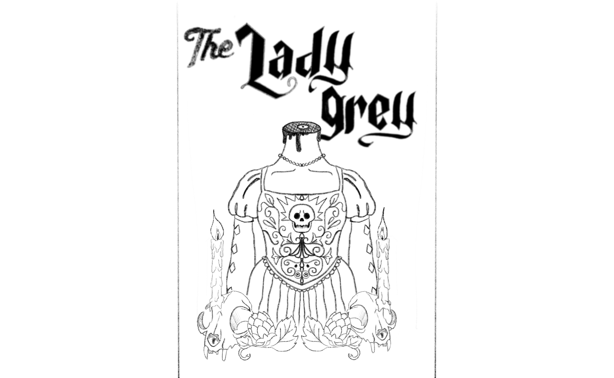
Tooth and Nail Lable Redesign

In a Mood For a Brew?
The Tooth and Nail project was a six-week exploration into beer can design, focusing on creating a cohesive concept that reflects the brand’s values with a fresh look.
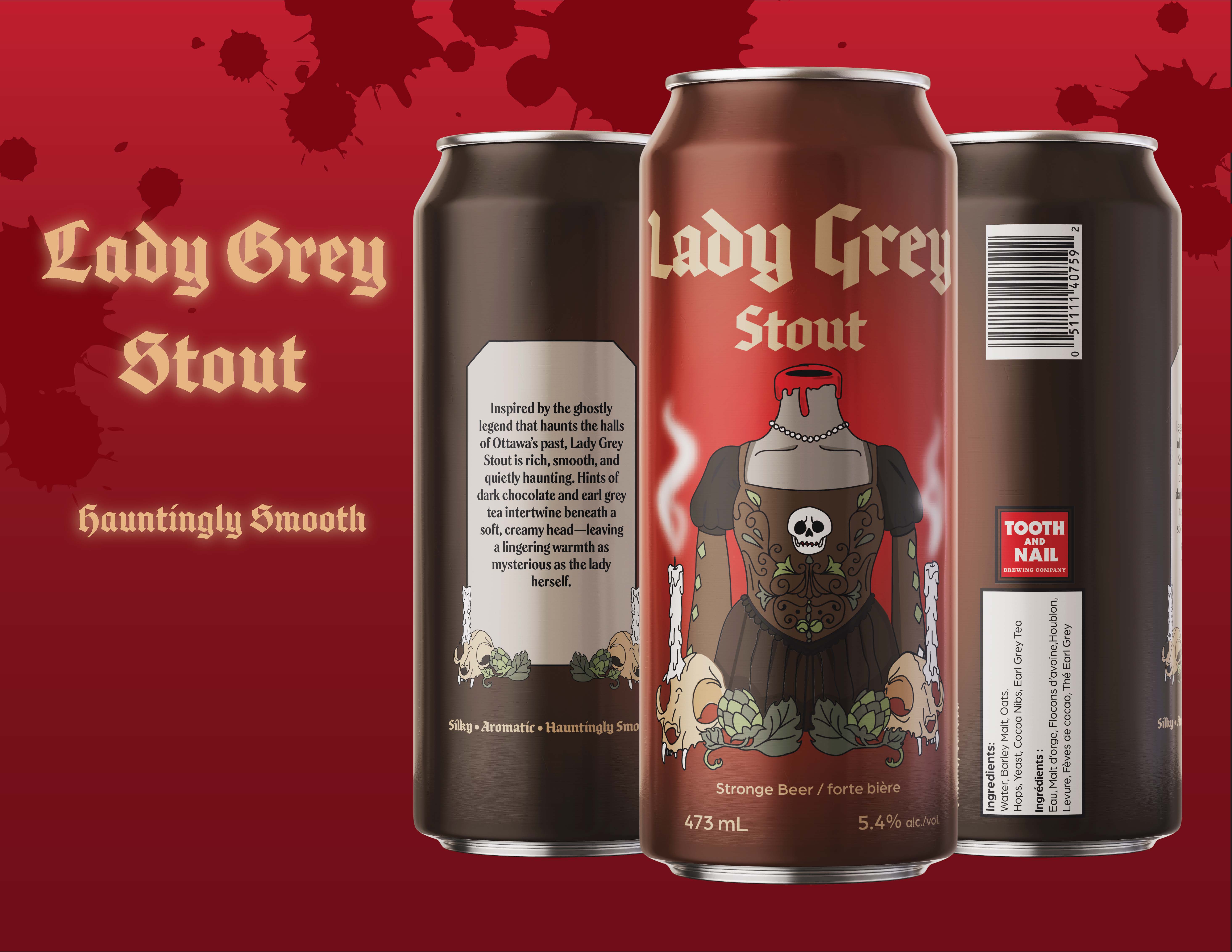
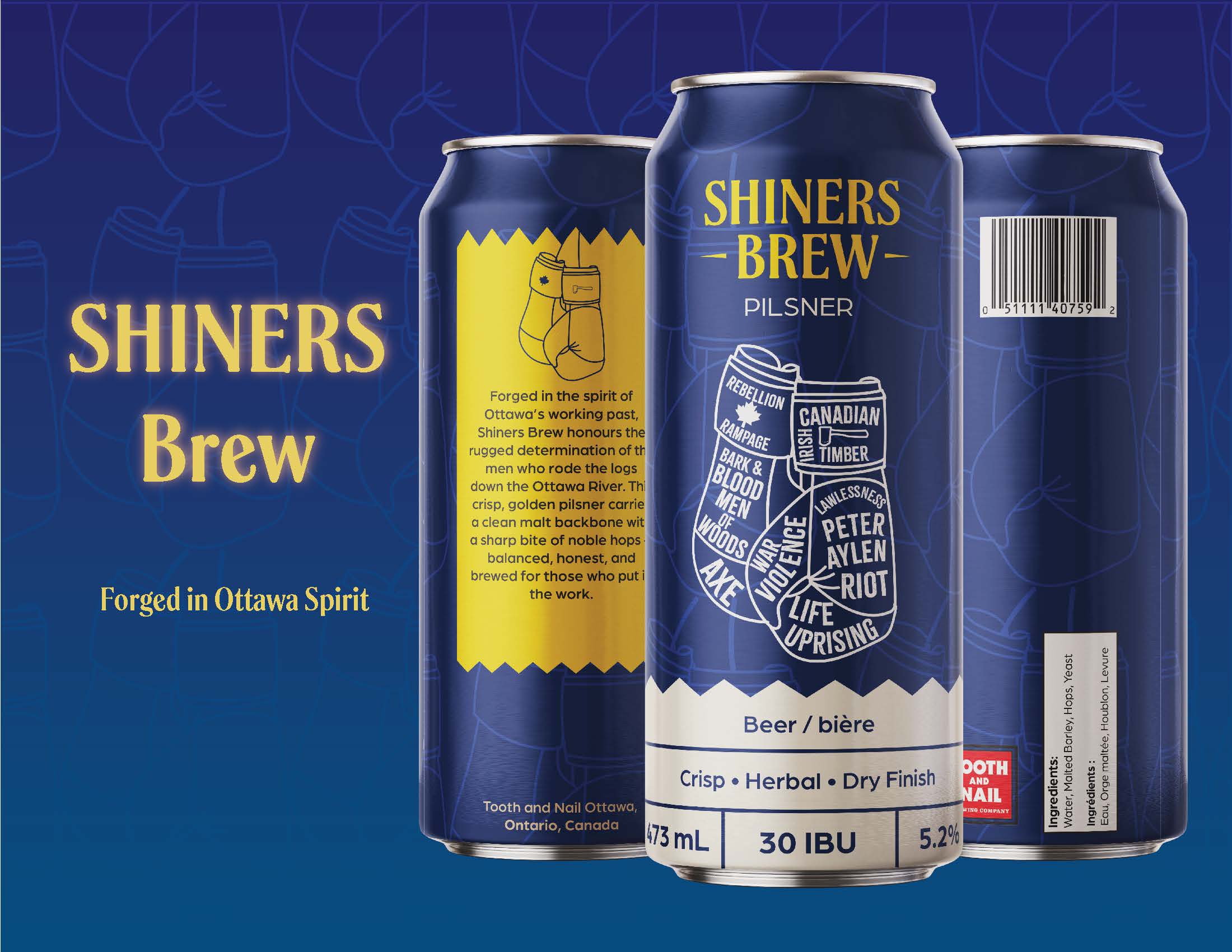
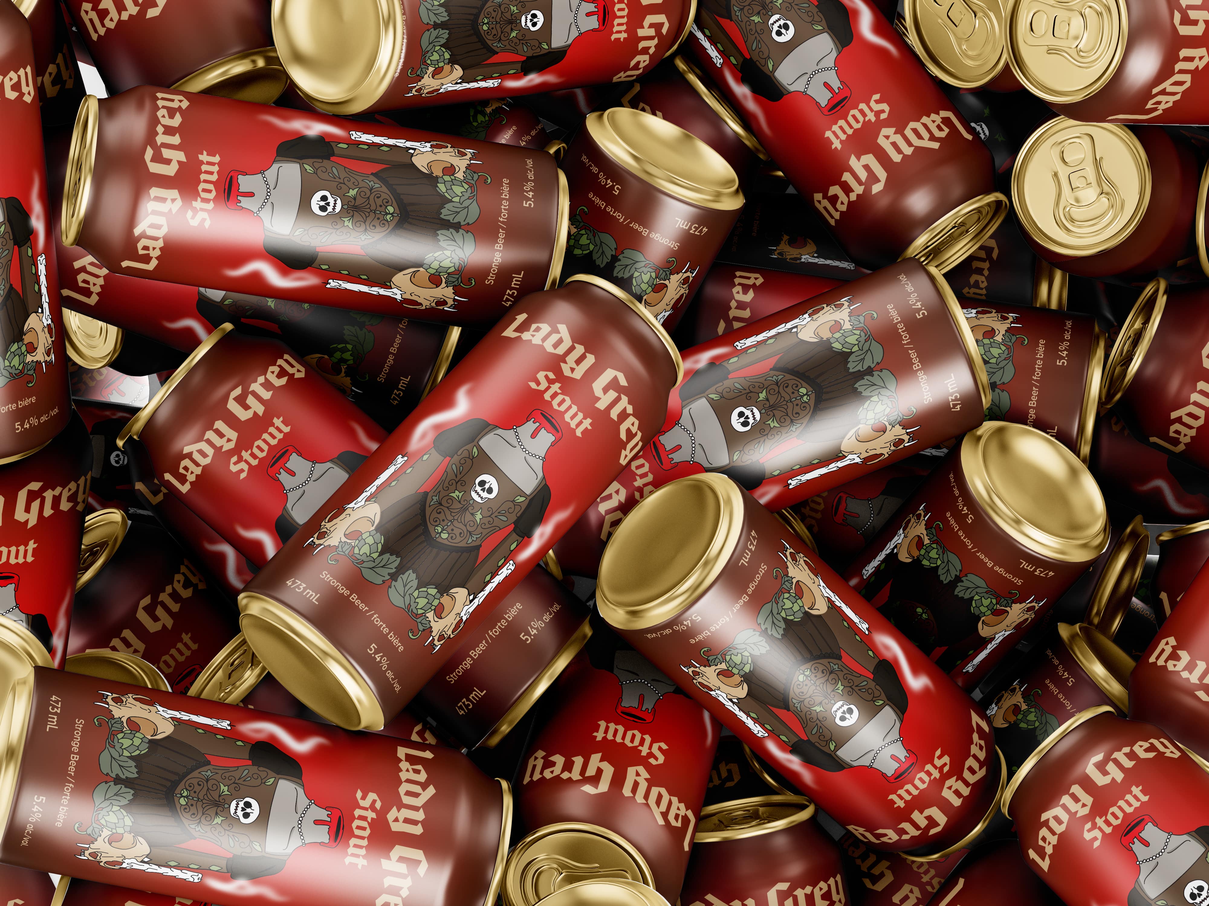
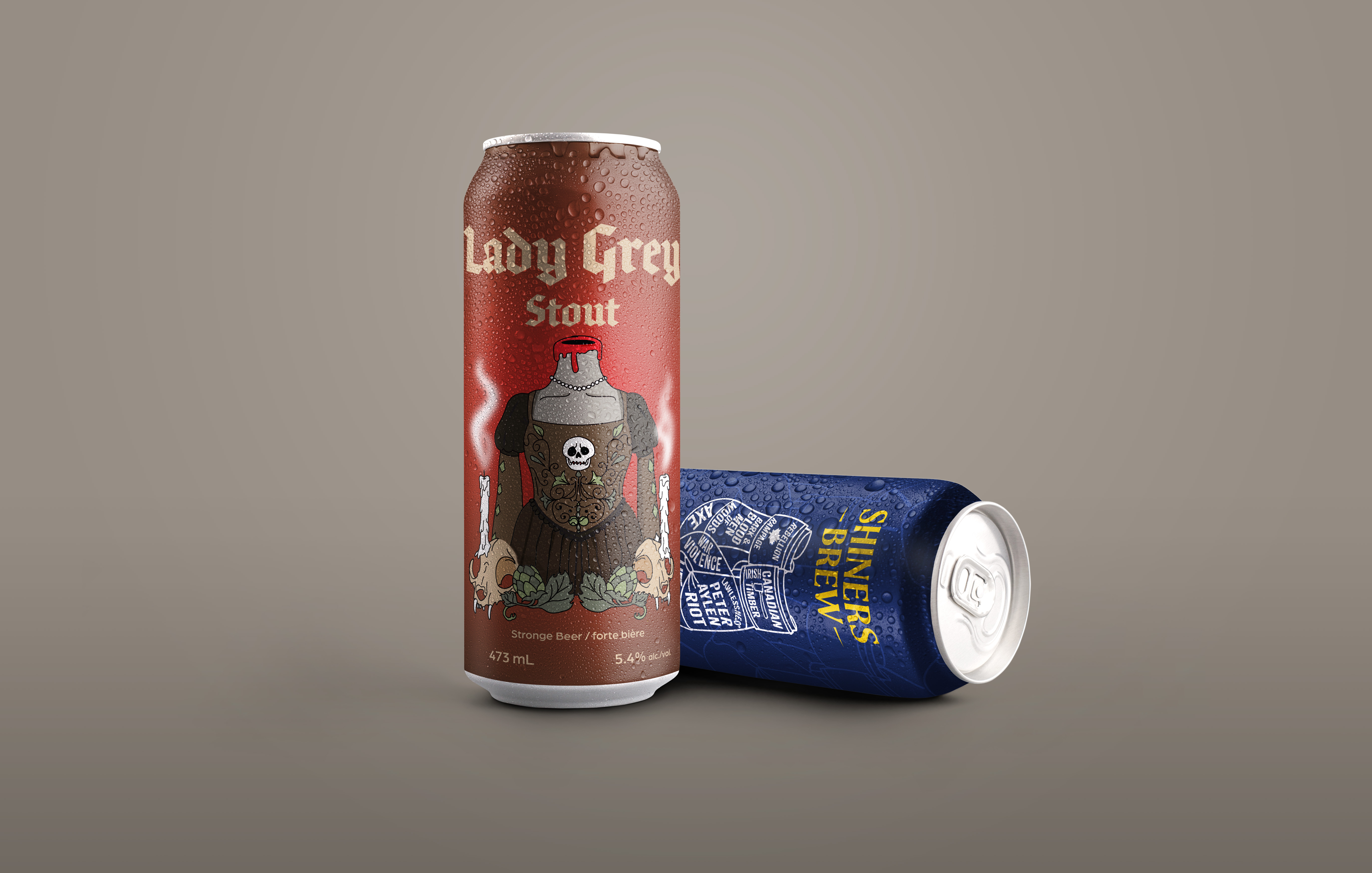
Tooth and Nail Brewery offers a variety of beers, primarily illustrated designs. I incorporated illustrations while exploring colour, with one design capturing a seasonal essence and the other suitable for high-cost production.
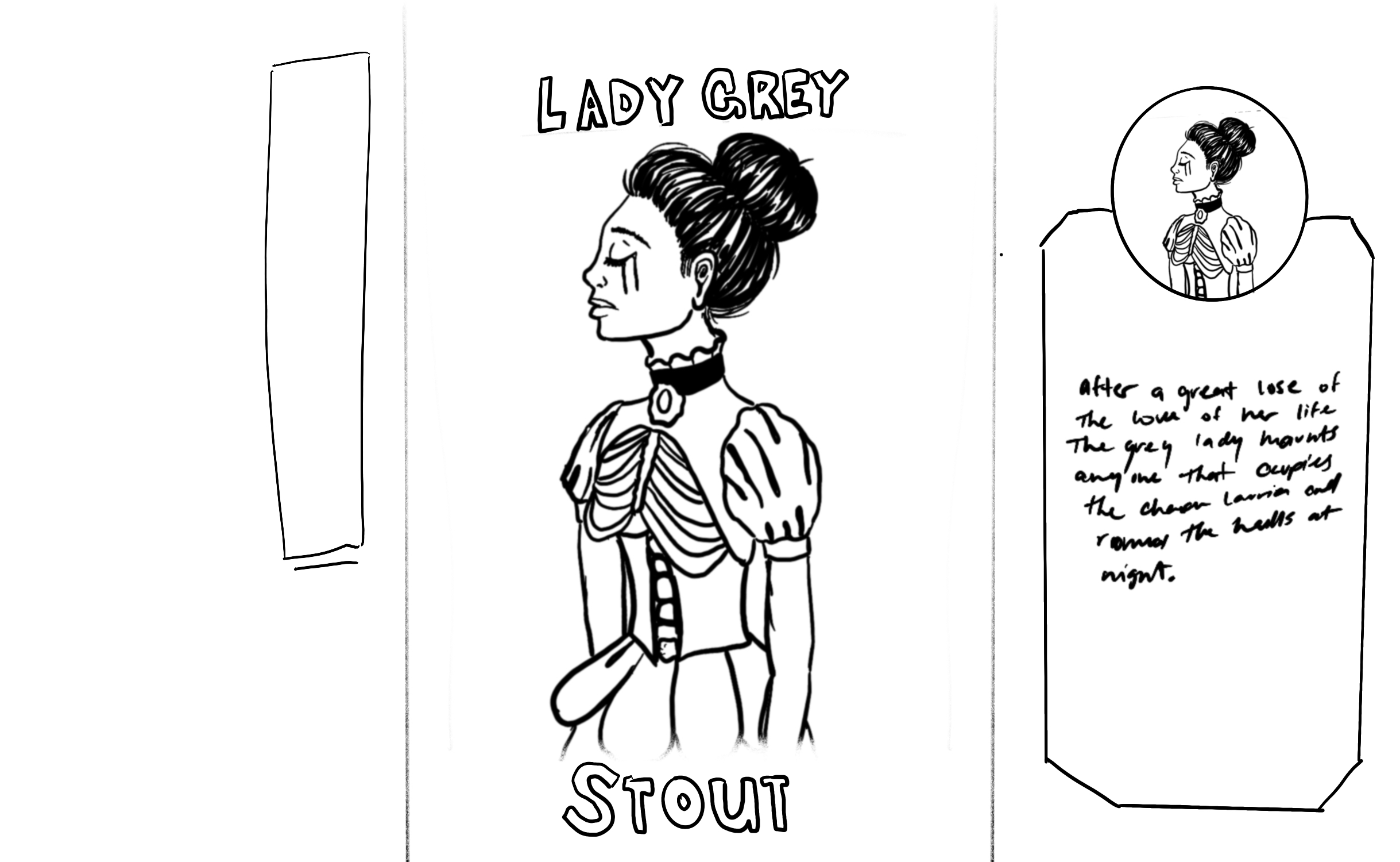
The Lady Grey Stout is inspired by the local legend of a ghost haunting the Château Laurier Hotel, making it fitting for October. As someone with nearly ten years in the restaurant industry, I believe seasonal experimentation in beer can designs is essential.
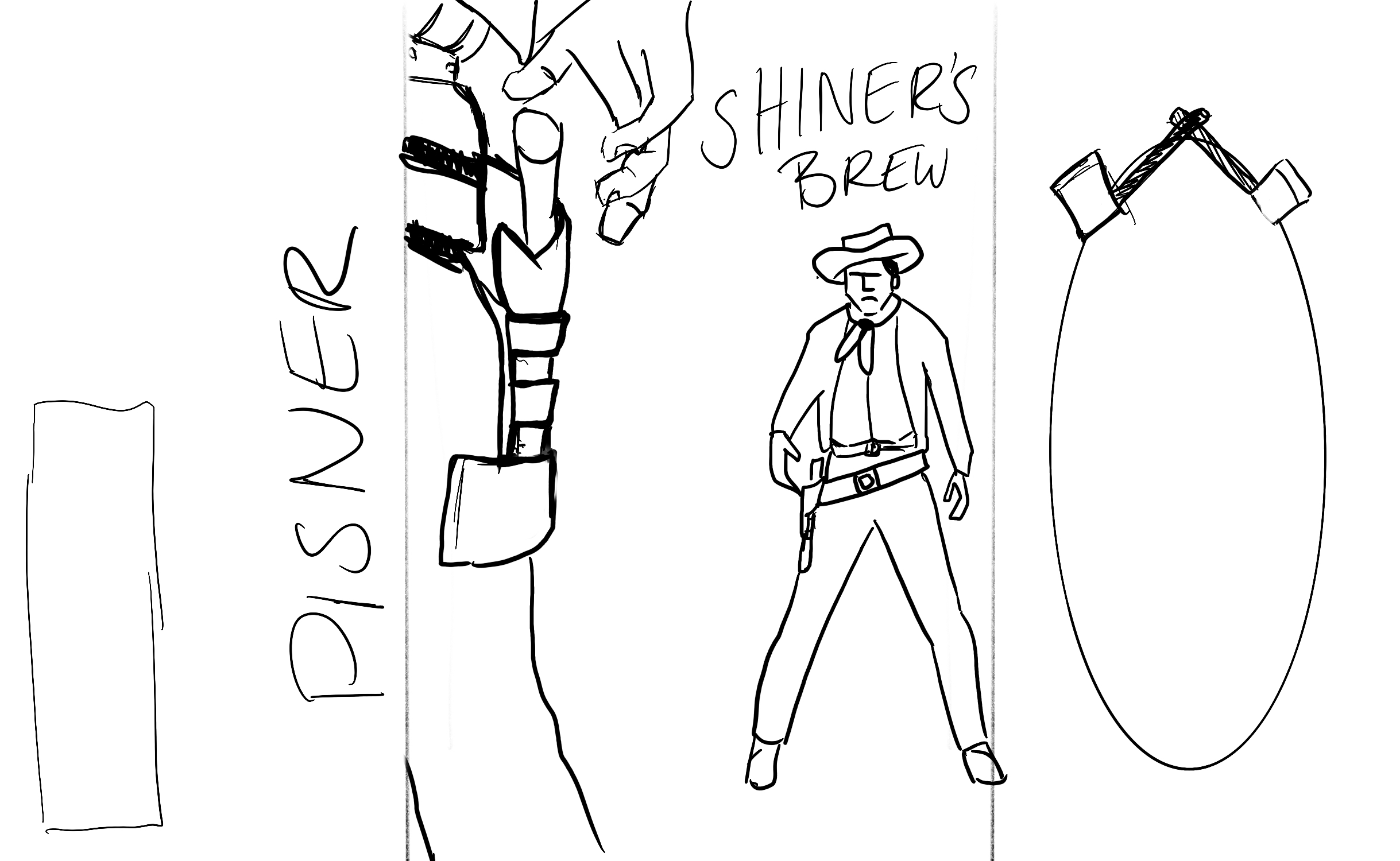
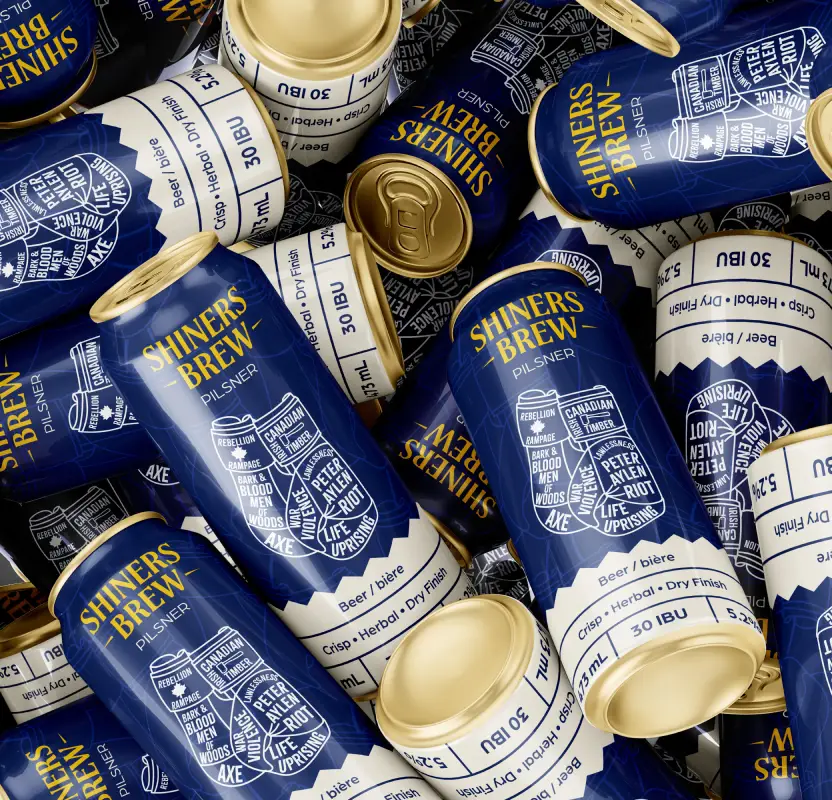
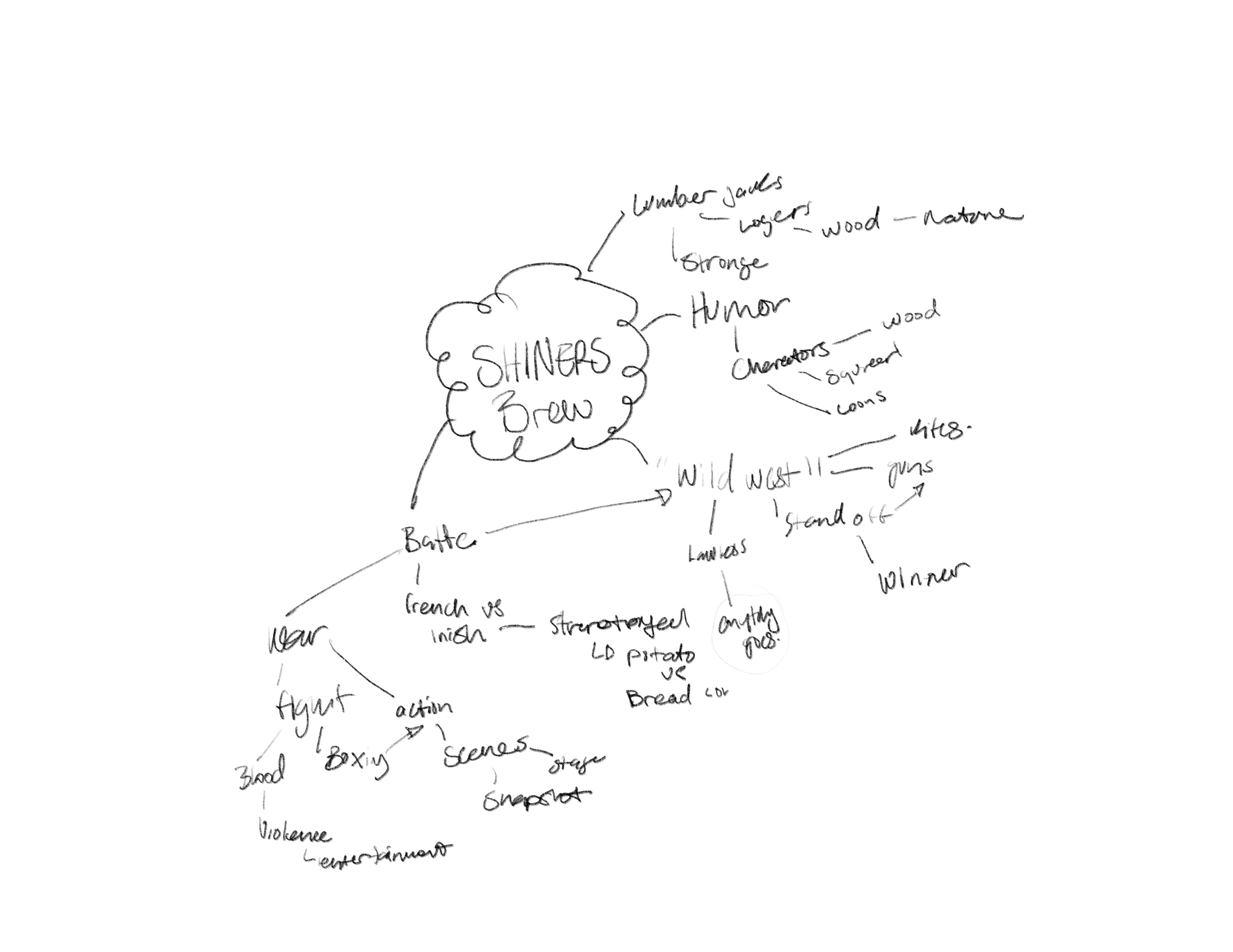
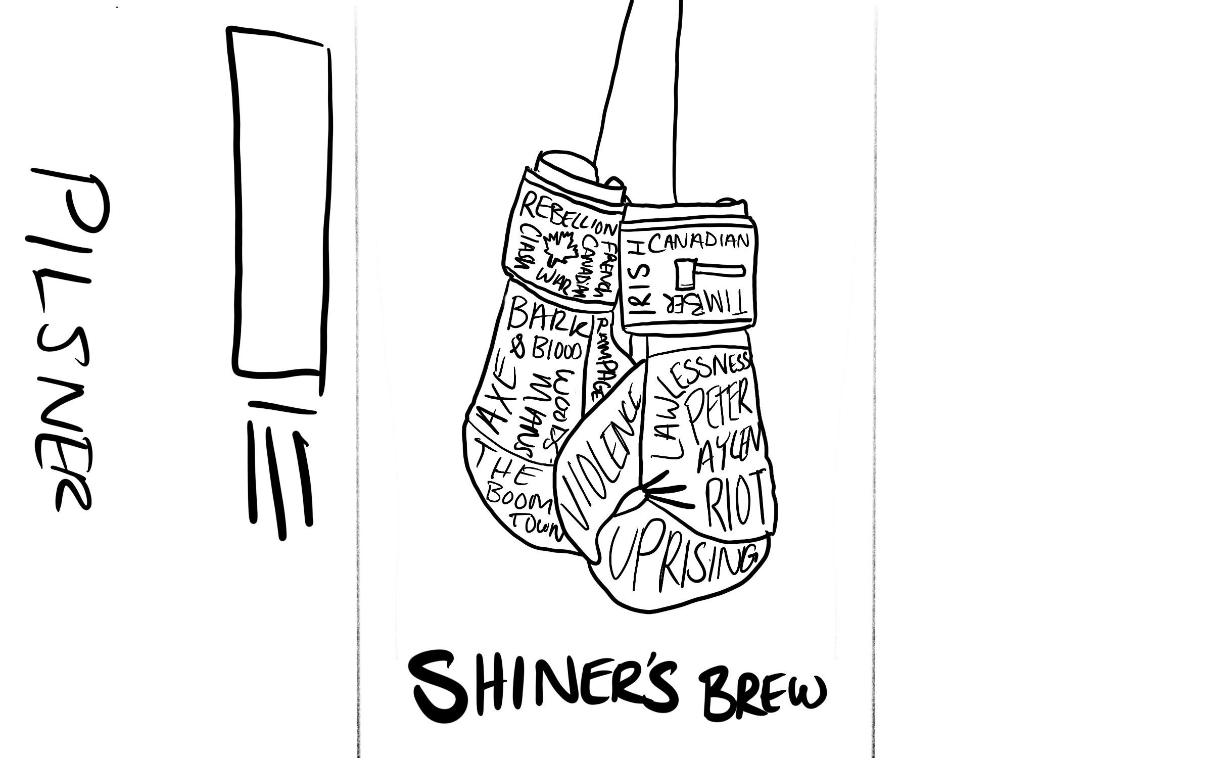
The Shiners Brew reflects the historical tension between French Canadians and Irish immigrants, illustrated with boxing gloves to symbolize resilience.
I am very pleased with the results of this project and look forward to working more in the hospitality industry, contributing to business success through clear concepts.
Image Gallery